Sunday, November 6, 2011

StyledImageView custom control in LiveCode (part 2)

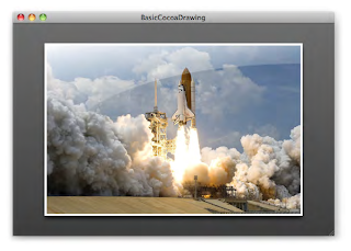
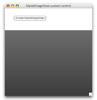
In the previous post, we started to work on a StyledImageView custom control, inspired by chapter 10 of the book 'Objective-C and Cocoa: Up and running' by Scott Stevenson. Just as a reminder, here's the original we're trying to mimic:


How far did we get last time?

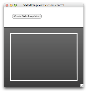
- A background gradient behind the image
- An image with a 4px white border
- A drop shadow below the image

And our custom control group has a behavior button script to handle resizing and toggling the display of the drop shadow. Now we come to the tricky part:

- A sheen over the image

Perhaps it's best to explain what a 'sheen' is: a visual effect that displays a glossy white overlay, clipped to a bezier curve, rendering the illusion of a light source in the upper-left corner of the image. Cute, but how does one implement it? Scott used a linear gradient (tilted slightly to enhance the illusion) to fill a path determined by the edges of the image and a bezier path. As LiveCode doesn't have bezier curves on offer, it was time to think a bit differently.

Let's start with the gradient. Linear gradients are not too difficult to implement; but we have to give it the right angle. Trigonometry has never been my best subject, but I remembered anough to figure out how to rotate the gradient by 10 degrees. And the LiveCode documentation came with example code for converting degrees to radians.
Here's an update for the "Create" button:

on mouseUp
local tGroup
CreateCustomControlGroup "StyledImageView", tGroup
CreateBackgroundGraphic tGroup
CreateViewImage tGroup
CreateSheen tGroup
set the behavior of tGroup to the long id of button "StyledImageView Behavior"
set the showShadow of tGroup to true
end mouseUp

private command CreateCustomControlGroup pGroupName, @rGroupId
-- same as before, omitting for brevity
end CreateCustomControlGroup

private command CreateBackgroundGraphic pGroup
-- same as before, omitting for brevity
end CreateBackgroundGraphic

private command CreateViewImage pGroup
-- same as before, omitting for brevity
end CreateViewImage

private command CreateSheen pGroup
CreateSheenGradient pGroup
end CreateSheen

private command CreateSheenGradient pGroup
reset the templateGraphic
set the style of the templateGraphic to "Rectangle"
set the rectangle of the templateGraphic to 30,130,370,310
set the lineSize of the templateGraphic to 0
set the opaque of the templateGraphic to true
set the fillGradient["type"] of the templateGraphic to "linear"
set the fillGradient["from"] of the templateGraphic to 30,130
set the fillGradient["to"] of the templateGraphic to 61,307
set the fillGradient["via"] of the templateGraphic to 207,99
set the fillGradient["ramp"] of the templateGraphic to \
"0.00000,255,255,255" & return & \
"0.40000,255,255,255,51" & return & \
"0.79999,255,255,255,13" & return & \
"0.80000,255,255,255,0" & return & \
"1.00000,255,255,255,0"
create graphic "GradientGraphic" in pGroup
reset the templateGraphic
end CreateSheenGradient


Delete the existing custom control group and hit the button again. You should see the gradient graphic on top of the image control.
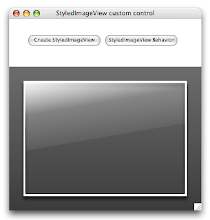


We'll also have to update the resizing logic in our behavior script, but I'll leave that for later. Our next challenge is the bezier curve, and how we can construct a path to clip the gradient to it. And then it struck me: we can achieve the same effect (in this case) by creating an oval graphic and then clip that out of the gradient graphic.

Inspiration came from an old blog post by RunRev's Mark Waddingham. The original blog is no onger on the web, but thanks to the Wayback Machine internet archive, I was able to dig up this snapshot. Here's the gist: you take two control, comlbine them into a group, and then use different blend modes for the group and graphics to achieve soft clipping.
The only difference: Mark talks about clipping something down to a graphic shape, whereas I wanted to clip a graphic shape out of the original shape. But as it turns out to, this was as easy as picking a different blend mode for the clipping graphic. So let's use this knowledge to once more update the "Create" button:

on mouseUp
local tGroup
CreateCustomControlGroup "StyledImageView", tGroup
CreateBackgroundGraphic tGroup
CreateViewImage tGroup
CreateSheen tGroup
set the behavior of tGroup to the long id of button "StyledImageView Behavior"
set the showShadow of tGroup to true
end mouseUp

private command CreateCustomControlGroup pGroupName, @rGroupId
-- same as before, omitting for brevity
end CreateCustomControlGroup

private command CreateBackgroundGraphic pGroup
-- same as before, omitting for brevity
end CreateBackgroundGraphic

private command CreateViewImage pGroup
-- same as before, omitting for brevity
end CreateViewImage

private command CreateSheen pGroup
local tSheenGroup
reset the templateGroup
set the rectangle of the templateGroup to 30,130,370,310
set the lockLocation of the templateGroup to true
set the margins of the templateGroup to 0
set the ink of the templateGroup to "blendSrcOver"
create group "SheenGroup" in pGroup
put it into tSheenGroup
reset the templateGroup

CreateSheenGradient tSheenGroup
CreateSheenClipping tSheenGroup
end CreateSheen

private command CreateSheenGradient pGroup
-- same as before, omitting for brevity
end CreateSheenGradient

private command CreateSheenClipping pGroup
reset the templateGraphic
set the style of the templateGraphic to "Oval"
set the rectangle of the templateGraphic to 10,10,10,10
set the ink of the templateGraphic to "blendDstOut"
set the lineSize of the templateGraphic to 0
set the opaque of the templateGraphic to true
create graphic "ClippingGraphic" in pGroup
set the rectangle of it to -21,154,761,586
reset the templateGraphic
end CreateSheenClipping


Delete the existing custom control group and hit the button again.
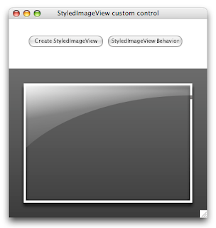

Getting there - now we just need to extend the behavior script with the logic to properly resize these new parts:

## engine message handlers

on mouseDoubleUp
-- same as before, omitting for brevity
end mouseDoubleUp

on resizeControl
-- same as before, omitting for brevity
end resizeControl

## property setters and getters

setProp showShadow pShowShadowBoolean
-- same as before, omitting for brevity
end showShadow

setProp showSheen pShowSheenBoolean
set the visible of group "SheenGroup" of me to pShowSheenBoolean
end showSheen

getProp showSheen
return the visible of group "SheenGroup" of me
end showSheen


setProp imageFileName pFileName
-- same as before, omitting for brevity
end imageFileName

getProp imageFileName
-- same as before, omitting for brevity
end imageFileName

## private commands and functions

private command SIV_ReshapeControl
local tImageRectangle
SIV_DetermineImageRectangle tImageRectangle
SIV_ReshapeBackground
SIV_ReshapeImage tImageRectangle
SIV_ReshapeSheen tImageRectangle
end SIV_ReshapeControl

private command SIV_DetermineImageRectangle @rImageRectangle
-- same as before, omitting for brevity
end SIV_DetermineImageRectangle

private command SIV_ReshapeBackground
-- same as before, omitting for brevity
end SIV_ReshapeBackground

private command SIV_ReshapeImage pImageRectangle
-- same as before, omitting for brevity
end SIV_ReshapeImage

private command SIV_ReshapeSheen pImageRectangle
set the rectangle of group "SheenGroup" of me to pImageRectangle
local tImageWidth, tImageHeight
put (item 3 of pImageRectangle) - (item 1 of pImageRectangle) into tImageWidth
put (item 4 of pImageRectangle) - (item 2 of pImageRectangle) into tImageHeight
--> reshape the gradient rect
local tGradientRectangle, tGradientHeight, tFromPoint, tToPoint, tViaPoint
put pImageRectangle into tGradientRectangle
put trunc(tImageHeight * 0.75) into tGradientHeight
put ((item 2 of tGradientRectangle) + tGradientHeight) into item 4 of tGradientRectangle
put (item 1 of tGradientRectangle), \
(item 2 of tGradientRectangle) \
into tFromPoint
put ((item 1 of tGradientRectangle) + trunc(SIV_SinInDegrees(10) * tGradientHeight)), \
((item 2 of tGradientRectangle) + trunc(SIV_CosInDegrees(10) * tGradientHeight)) \
into tToPoint
put ((item 1 of tGradientRectangle) + trunc(SIV_SinInDegrees(80) * tGradientHeight)), \
((item 2 of tGradientRectangle) - trunc(SIV_CosInDegrees(80) * tGradientHeight)) \
into tViaPoint
set the rectangle of graphic "GradientGraphic" of group "SheenGroup" of me to tGradientRectangle
set the fillGradient["from"] of graphic "GradientGraphic" of group "SheenGroup" of me to tFromPoint
set the fillGradient["to"] of graphic "GradientGraphic" of group "SheenGroup" of me to tToPoint
set the fillGradient["via"] of graphic "GradientGraphic" of group "SheenGroup" of me to tViaPoint
--> reshape the clipping oval
local tClippingRectangle, tXRadius, tYRadius
put trunc(tImageWidth * 1.15) into tXRadius
put trunc(tImageHeight * 0.9) into tYRadius
put ((item 3 of pImageRectangle) - tXRadius), \
((item 4 of pImageRectangle) - tYRadius), \
((item 3 of pImageRectangle) + tXRadius), \
((item 4 of pImageRectangle) + tYRadius) \
into tClippingRectangle
set the rectangle of graphic "ClippingGraphic" of group "SheenGroup" of me to tClippingRectangle
end SIV_ReshapeSheen

private function SIV_SinInDegrees angleInDegrees
return sin(angleInDegrees * pi / 180)
end SIV_SinInDegrees

private function SIV_CosInDegrees angleInDegrees
return cos(angleInDegrees * pi / 180)
end SIV_CosInDegrees


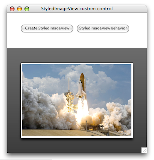
Delete the existing custom control group and hit the "Create" button again. Then double-click to select an image. I downloaded and selected the original image that Scott used - a public domain image from NASA.
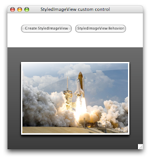


I would say that this looks like the original StyledImageViewClass. Next time, we'll take this custom control a bit further, by turning it into a DropTool. Stay tuned...
Tuesday, November 1, 2011

StyledImageView custom control in LiveCode

In an effort to get back into native development on MacOS X, I've been working my way through the book 'Cocoa and Objective-C: Up and running' by Scott Stevenson. Chapter 10 (Custom Views and Drawing) describes step by step how to build a StyledImageView class.
And I have to say it looks pretty nice:


Curious as ever, I started to wonder how this same effect could be achieved as a custom control in LiveCode. What do we have conceptually?
- A background gradient behind the image
- An image with a 4px white border
- A drop shadow below the image
- A sheen over the image
The first three items are quite straightforward; but the sheen proved more difficult.

Let's get started. Note that I'm doing all my control creation and property settings via script. Just drop a button onto a new stack, set its script, and click on the button to get the custom control group. The first thing we want is the group itself and gradient background; easy enough:

on mouseUp
local tGroup
CreateCustomControlGroup "StyledImageView", tGroup
CreateBackgroundGraphic tGroup
end mouseUp

private command CreateCustomControlGroup pGroupName, @rGroupId
reset the templateGroup
set the margins of the templateGroup to 0
create group pGroupName
put it into rGroupId
reset the templateGroup
end CreateCustomControlGroup

private command CreateBackgroundGraphic pGroup
reset the templateGraphic
set the style of the templateGraphic to "Rectangle"
set the rectangle of the templateGraphic to 0,0,400,300
set the lineSize of the templateGraphic to 0
set the opaque of the templateGraphic to true
set the fillGradient["type"] of the templateGraphic to "linear"
set the fillGradient["from"] of the templateGraphic to 0,300
set the fillGradient["to"] of the templateGraphic to 0,0
set the fillGradient["via"] of the templateGraphic to 400,300
set the fillGradient["ramp"] of the templateGraphic to \
"0.00000,45,45,45" & return & "1.00000,89,89,89"
create graphic "BackgroundGraphic" in pGroup
reset the templateGraphic
end CreateBackgroundGraphic

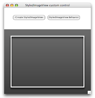
Here's the result of clicking on the button:


Now let's add in the image. Something that initially trips up a lot of new LiveCode developers is that an image will happily jump back to its original size if you don't set the 'lockLocation' of the image to "true". Another quirk is that you can't set the borderColor of an image control directly. However, it does 'inherit' the borderColor from the chain of owners (the containing group if applicable, the card or the stack) so to make sure we get a white border, we need to set the borderColor of our custom control group. So the following update to the button script will do nicely:

on mouseUp
local tGroup
CreateCustomControlGroup "StyledImageView", tGroup
CreateBackgroundGraphic tGroup
CreateViewImage tGroup
end mouseUp

private command CreateCustomControlGroup pGroupName, @rGroupId
reset the templateGroup
set the margins of the templateGroup to 0
set the borderColor of the templateGroup to "white"
create group pGroupName
put it into rGroupId
reset the templateGroup
end CreateCustomControlGroup

private command CreateBackgroundGraphic pGroup
-- same as before, omitting for brevity
end CreateBackgroundGraphic

private command CreateViewImage pGroup
reset the templateImage
set the rectangle of the templateImage to 30,30,370,270
set the borderWidth of the templateImage to 4
set the threeD of the templateImage to false
set the showBorder of the templateImage to true
set the resizeQuality of the templateImage to "best"
set the lockLocation of the templateImage to true
create image "ViewImage" in pGroup
reset the templateImage
end CreateViewImage


Delete the existing custom control group, and hit the button again. Here's what you should see:


Next up is the drop shadow for the image. While we could do this by setting the properties in the 'CreateViewImage' command above, I think it's better of we don't repeat code, and put that in the custom control group script - after all, we want to be able to toggle it via script. So let's drop another button on the stack, set its name to "StyledImageView Behavior" and start scripting that button. Later on, we'll set the 'behavior' property of the custom control group.

The most important item in the behavor script is handling resizing. We want to leave a margin of 10% around the image so that we can see the gradient background, and we want to scale the image proportionately rather than stretch it out. While we're add it, we'll add some custom property setters and getters for the drop shadow and the image file name. And we'll add a 'mouseDoubleUp' handler to allow the user to select an image. Here is the first version of the behavior script:

## engine message handlers

on mouseDoubleUp
answer file "Select an image to view"
if it is empty then exit mouseDoubleUp
set the imageFileName of me to it
pass mouseDoubleUp
end mouseDoubleUp

on resizeControl
SIV_ReshapeControl
pass resizeControl
end resizeControl

## property setters and getters

setProp showShadow pShowShadowBoolean
if pShowShadowBoolean is "true" then
local tDropShadow
put 0,0,0 into tDropShadow["color"]
put 8 into tDropShadow["size"]
put 6 into tDropShadow["distance"]
put 90 into tDropShadow["angle"]
put 0 into tDropShadow["spread"]
put 255 into tDropShadow["opacity"]
put "normal" into tDropShadow["blendmode"]
put "box3pass" into tDropShadow["filter"]
put true into tDropShadow["knockout"]
set the dropShadow of image "ViewImage" of me to tDropShadow
else
set the dropShadow of image "ViewImage" of me to empty
end if
pass showShadow
end showShadow

setProp imageFileName pFileName
set the fileName of image "ViewImage" of me to pFileName
SIV_ReshapeControl
end imageFileName

getProp imageFileName
return the fileName of image "ViewImage" of me
end imageFileName

## private commands and functions

private command SIV_ReshapeControl
local tImageRectangle
SIV_DetermineImageRectangle tImageRectangle
SIV_ReshapeBackground
SIV_ReshapeImage tImageRectangle
end SIV_ReshapeControl

private command SIV_DetermineImageRectangle @rImageRectangle
-- 10% margin around the image while preserving the aspect ratio
local tSourceWidth, tSourceHeight, tTargetWidth, tTargetHeight
put the formattedWidth of image "ViewImage" of me into tSourceWidth
put the formattedHeight of image "ViewImage" of me into tSourceHeight
put (the width of me) * 0.8 into tTargetWidth
put (the height of me) * 0.8 into tTargetHeight
-- make sure we don't get divide by zero errors
if tSourceWidth = 0
then put 1 into tSourceWidth
if tSourceHeight = 0
then put 1 into tSourceHeight
local tScaleFactor, tImageWidth, tImageHeight
put min(tTargetWidth / tSourceWidth, tTargetHeight / tSourceHeight) into tScaleFactor
put trunc(tSourceWidth * tScaleFactor) into tImageWidth
put trunc(tSourceHeight * tScaleFactor) into tImageHeight
local tLeft, tTop
put (the left of me) + (((the width of me) - tImageWidth) div 2) into tLeft
put (the top of me) + (((the height of me) - tImageHeight) div 2) into tTop
put tLeft,tTop,(tLeft + tImageWidth),(tTop + tImageHeight) into rImageRectangle
end SIV_DetermineImageRectangle

private command SIV_ReshapeBackground
set the rectangle of graphic "BackgroundGraphic" of me to the rectangle of me
end SIV_ReshapeImage

private command SIV_ReshapeImage pImageRectangle
set the rectangle of image "ViewImage" of me to pImageRectangle
end SIV_ReshapeImage

So just a little tweak to our 'Create' button script is required to set the behavior and activate the drop shadow:

on mouseUp
local tGroup
CreateCustomControlGroup "StyledImageView", tGroup
CreateBackgroundGraphic tGroup
CreateViewImage tGroup
set the behavior of tGroup to the long id of button "StyledImageView Behavior"
set the showShadow of tGroup to true

end mouseUp

private command CreateCustomControlGroup pGroupName, @rGroupId
-- same as before, omitting for brevity
end CreateCustomControlGroup

private command CreateBackgroundGraphic pGroup
-- same as before, omitting for brevity
end CreateBackgroundGraphic

private command CreateViewImage pGroup
-- same as before, omitting for brevity
end CreateViewImage

One more thing to do before we call it a day: handle the 'resizeStack' message in the card script, so that we automatically resize the custom control group as the user changes the stack size. Just plop the following into the card script:

on resizeStack pNewWidth, pNewHeight
if there is a group "StyledImageView" then
local tRectangle
put the rectangle of group "StyledImageView" into tRectangle
put pNewWidth into item 3 of tRectangle
put pNewHeight into item 4 of tRectangle
set the rectangle of group "StyledImageView" to tRectangle
end if
pass resizeStack
end resizeStack

Delete the existing custom control group and hit the button again. The embedded image control now has a nice drop shadow, which we can turn off and on using the message box or by scripting a simple checkbox button.


And when you double-click on the custom control, you can select an image file and the embedded image control automagically reshapes in order to display the chosen image file proportionately.


Looks good doesn't it? Next time, we'll tackle the sheen. It's tricky, but it can be done!

Sunday, October 2, 2011

MacOSX standard artwork in LiveCode

When you develop an application for Mac, users have certain expectations about how your app will look and behave. One of the often forgotten parts of your user interface is the icon artwork - it is very tempting to simply buy an icon collection and then use it everywhere in your cross-platform application. However, to help developers achieve a consistent user interface, across multiple versions of the operating system, Apple has been adding 'template' images to its Cocoa NSImage class.

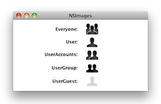
Here are a few examples which I recently used in a project:


For a complete list of the available template images, look here.

Great stuff, but how are we going to get at it from LiveCode? Not directly, I'm afraid. But all is not lost: a while back, Apple's Java engineers added to their Java implementation on MacOS X 10.5 Leopard (and later) the ability to fetch these images using a simple call:
Toolkit.getDefaultToolkit().getImage("NSImage://NSColorPanel")

You can see where I'm heading with this: writing a helper Java class that you can execute with a simple 'shell' function call. So let's start by writing up the Java class code. We'll set it up with two parameters: the first parameter accepts either "*" (to say you want a complete set of images) or a comma-separated list of image names; the second parameter is the output directory where the available images will be saved in PNG format.

import java.awt.Graphics;
import java.awt.Image;
import java.awt.Toolkit;
import java.awt.image.BufferedImage;
import java.io.File;
import java.io.IOException;
import java.util.EnumSet;
import javax.imageio.ImageIO;

public class NSImageFetcher {

public enum NSImageName {
// Image Template Constants
NSQuickLookTemplate,
NSBluetoothTemplate,
NSIChatTheaterTemplate,
NSSlideshowTemplate,
NSActionTemplate,
NSSmartBadgeTemplate,
NSPathTemplate,
NSInvalidDataFreestandingTemplate,
NSLockLockedTemplate,
NSLockUnlockedTemplate,
NSGoRightTemplate,
NSGoLeftTemplate,
NSRightFacingTriangleTemplate,
NSLeftFacingTriangleTemplate,
NSAddTemplate,
NSRemoveTemplate,
NSRevealFreestandingTemplate,
NSFollowLinkFreestandingTemplate,
NSEnterFullScreenTemplate,
NSExitFullScreenTemplate,
NSStopProgressTemplate,
NSStopProgressFreestandingTemplate,
NSRefreshTemplate,
NSRefreshFreestandingTemplate,
NSFolder,
NSTrashEmpty,
NSTrashFull,
NSHomeTemplate,
NSBookmarksTemplate,
NSCaution,
NSStatusAvailable,
NSStatusPartiallyAvailable,
NSStatusUnavailable,
NSStatusNone,
NSApplicationIcon,
NSMenuOnStateTemplate,
NSMenuMixedStateTemplate,
NSUserGuest,
NSMobileMe,
// Multiple Documents Drag Image
NSMultipleDocuments,
// Sharing Permissions Names Images
NSUser,
NSUserGroup,
NSEveryone,
// System Entity Images
NSBonjour,
NSDotMac,
NSComputer,
NSFolderBurnable,
NSFolderSmart,
NSNetwork,
// Toolbar Named Images
NSUserAccounts,
NSPreferencesGeneral,
NSAdvanced,
NSInfo,
NSFontPanel,
NSColorPanel,
// View Type Template Images
NSIconViewTemplate,
NSListViewTemplate,
NSColumnViewTemplate,
NSFlowViewTemplate;
}


public static Image getNSImage(final NSImageName nsImageName) {
return getNSImage(nsImageName.name());
}

public static Image getNSImage(final String nsImageName) {
return Toolkit.getDefaultToolkit().getImage("NSImage://" + nsImageName);
}

public static void saveNSImage(final NSImageName nsImageName, final File outputFile) throws IOException {
saveNSImage(nsImageName.name(), outputFile);
}

public static void saveNSImage(final String nsImageName, final File outputFile) throws IOException {
final Image nsImage = getNSImage(nsImageName);
if (nsImage != null) {
BufferedImage bufferedImage = null;
if (nsImage instanceof BufferedImage) {
bufferedImage = (BufferedImage) nsImage;
} else {
bufferedImage = new BufferedImage(nsImage.getWidth(null), nsImage.getHeight(null), BufferedImage.TYPE_INT_ARGB);
final Graphics bufImgGraphics = bufferedImage.getGraphics();
bufImgGraphics.drawImage(nsImage, 0, 0, null);
}
if (!outputFile.exists()) {
outputFile.createNewFile();
}
ImageIO.write(bufferedImage, "png", outputFile);
}
}

public static void main(String[] args) throws IOException {
// We can't run in headless mode or we get empty icons
// System.setProperty("java.awt.headless", "true");

if (args.length != 2) {
System.out.println("Usage: java NSImageFetcher <list of NSImageNames>,<output directory>");
return;
}
final File outputDirectory = new File(args[1]);
if ("*".equals(args[0])) {
for (final NSImageName nsImageName : EnumSet.allOf(NSImageName.class)) {
final File outputFile = new File(outputDirectory.getAbsolutePath() + File.separator + nsImageName.name() + ".png");
saveNSImage(nsImageName, outputFile);
}
} else {
for (final String nsImageName : args[0].split(",")) {
try {
final File outputFile = new File(outputDirectory.getAbsolutePath() + File.separator + nsImageName + ".png");
saveNSImage(nsImageName, outputFile);
} catch (IllegalArgumentException e) {
// ignore
}
}
}
}
}

And here's the LiveCode button script to put all the images into a subdirectory 'resources' in the directory where the stack is saved:

on mouseUp
-- save settings
local tOldDefaultFolder, tOldHideConsoleWindows
put the defaultFolder into tOldDefaultFolder
set the defaultFolder to StackFolderPath()
put the hideConsoleWindows into tOldHideConsoleWindows
set the hideConsoleWindows to true
-- call the command line via shell
local tShellCommand, tShellResult
put "java NSImageFetcher" && \
quote & "*" & quote && \
quote & StackFolderPath("resources") & quote into tShellCommand
answer tShellCommand & return & shell(tShellCommand)
-- restore settings
set the defaultFolder to tOldDefaultFolder
set the hideConsoleWindows to tOldHideConsoleWindows
-- go ahead and link
end mouseUp

function StackFolderPath pRelativePath
local tPath
put the effective filename of this stack into tPath
set the itemDelimiter to slash
if pRelativePath is empty then
delete item -1 of tPath
else
put pRelativePath into item -1 of tPath
end if
return tPath
end StackFolderPath

Okay, MacOSX comes with a preinstalled Java runtime so the above should work on MacOSX 10.5 Leopard, MacOSX 10.6 Snow Leopard and even on MacOSX 10.7 Lion (since there's still a Java 6 'out of the box'). Naturally, the artwork may change between operating system versions. So my approach would be to:
- check if there is a '<MyCompanyName>/<MyAppName>/resources' directory in the user's preferences directory (by means of the 'specialFolderPath' function);
- if the directory is absent, create it and use the 'shell' function as above to fetch the images I need, and save the 'systemVersion' in a text file in the same directory
- if the directory is present, compare the current value of the 'systemVersion' with the one saved in said directory, and once again fetch the images if there's a difference

It's up to you to either use references to these .PNG images by setting the 'filename' property of an 'image' control; or to then import the .PNG files into a stack.

Note that this artwork is copyrighted by Apple, Inc. You shouldn't extract it and then use it in your apps on any platform other than MacOSX. Oh, and please head the warning "You should always use named images according to their intended purpose, and not according to how the image appears when loaded. The appearance of images can change between releases. If you use an image for its intended purpose (and not because of it looks), your code should look correct from release to release."

Sunday, September 25, 2011

Determining the Aqua UI appearance on MacOS X

Due to high workload at the day-job, I haven't been able to keep my schedule regarding the experiment building a Ribbon custom control for LiveCode. It's still going to happen, but is going to take a bit longer than planned. In the meantime, I will post some tidbits that are relevant to those that design custom controls for LiveCode.

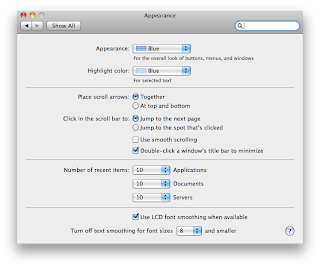
In MacOS X, the Preferences application has a panel titled Appearance:


Yeah, I know I'm still on MacOS X Snow Leopard 10.6.8 - just waiting for Lion 10.7.2 before I upgrade.
Anyway, the Appearance option menu has two entries: Blue and Graphite.


Below that option menu, is the Highlight color option menu; and if we want to know this color in our LiveCode scripts, all we have to do is check the global 'hiliteColor' property. But there's no built-in way to access the Appearance. So how can we get this information? Do we have to write an external to find out whether we should have blue or graphite custom controls?

As it turns out, we can get at this system setting by using the 'defaults' command via the 'shell' function. Just plop the following in a button script:

on mouseUp
local tVariant, tAppearance
put word 1 to -1 \
of shell("defaults read -g AppleAquaColorVariant") \
into tVariant
switch tVariant
case 1
put "Blue" into tAppearance
break
case 6
put "Graphite" into tAppearance
break
default
put "Unrecognized appearance variant [" & \
tVariant & "]" into tAppearance
break
end switch
answer tAppearance
end mouseUp


Click the button, and depending on your operating system and preferences setting, you'll see the appropriate message. It appears that at one point there were a few more appearances, but they were lost during a chopping frenzy in Cupertino. Be that as it may, you now have a way to check for the appearance setting in the preferences window.

Sunday, August 7, 2011

Experimenting with ribbons in LiveCode (part 4)

Four weeks ago, we kicked off an experiment to create a ribbon control for LiveCode. By now, we have a clear goal, derived an initial XML structure for our 'ribbonText' property, and in the previous post, we finally got some visual work done, implementing the ribbon background and tabs. The next logical step is to implement our ribbon groups.

There is actually more to a ribbon group than initially meets the eye:
- groups can have an associated dialog (e.g. to call up the classic font dialog)
- groups can be added to the quick access toolbar
- groups have rules for dynamic resizing

But we'll postpone these juicier bits until wev'e gotten around to actually adding buttons to our ribbon control. Right now, our goal is to turn the group definitions in our ribbonText property into controls. First we extend the ribbonText parser to also read the <Group> definitions from the XML structure, and then we add the necessary code to the 'qrtRexRibbonGroupsBehavior' script. Under our current (limited) interpretation, each ribbon group is nothing more than the label and the separator next to it.

Once more, I've opted for the approach of taking a slice from a screenshot to represent the separator, as I couldn't get the stroke and fill gradients of a graphic to exactly mirror the original. Maybe one of these days I'll throw out the images and replace them all with gradients anyway - but today is not that day. At any rate, with just two controls to add, it's pretty easy.


And by separating out the code that triggers the population of the nested RibbonGroups custom control group, we can easily switch ribbon group sets by handling the custom 'ribbonTabPick' event that is dispatched from the nested RibbonTabs custom control group which we implemented in the previous post.

Download the current revision here - next time we'll tackle the buttons.

Tuesday, August 2, 2011

Experimenting with ribbons in LiveCode (part 3)

Three weeks ago, we kicked off an experiment to create a ribbon control for LiveCode. By now, we have a good plan, and we have an initial XML structure for our 'ribbonText' property. So let's go ahead and start putting together some code! Let's start with the ribbon background and header area, shall we?

I really wanted to do it all with only graphics, gradients and effects, but I couldn't quite get the details right. So eventually I went for the oldest trick in the book: I took a screenshot and then extracted three slices from the image: 2 pixels wide for the left and right edge, and then 1 pixel wide for the center. You can't use this slice as a pattern for another control, but you can just stretch that image as far as you need: because the original is only 1 pixel wide, the engine can stretch the image at a low cost, because there is no interpolation required.


Let's get a head start on the ApplicationMenu button: take some more screenshots while hovering and after clicking on it; then extract the images for each state of the ApplicationMenu; drop in a button and assign the appropriate image ids for the button's regular, hilited and hover icons. This is not the time for the menu itself, though, so let's move on to the ribbon tabs.


But before that, let's drop in a field "RibbonText" and a button to apply it to our ribbon group. It will make testing a whole lot easier as we go and add features.


Pop quiz: what is the fastest way to create a custom tab header in LiveCode?
Answer: why, a radio button group, of course!

I know what you're thinking: "Hold on, have you lost your marbles? Doesn't a group of radio buttons look like this?"


Well, sure - but by setting a few properties, you can turn that into this:


And that's accomplished without any scripting; once you start handling mouse event messages, you can dynamically apply graphic effects to even greater effect. But that won't suffice for our ribbon, I'm afraid, altough the principle stands: a group of 'radio buttons' can adequately implement our ribbon tabs, as long as they don't have to do it on their own...

There are several factors that determine a ribbon tab's appearance: whether or not the tab is hilited, whether or not the mouse is hovering over the tab, and whether the mouse is pressed or not. So we will enlist the help of some image controls to achieve each of these appearances.

Once again, we use an image editor to take three slices from a screenshot: one for the left edge, one for the right edge, and another to serve as a background, stretched accross the gap. Rinse and repeat for each appearance. The width of the tab can be calculated by taking the formattedWidth of the button, and adding another eighteen pixels, nine on each side, for good measure.

With our approach clearly outlined, we can code the creation of all the controls needed for the ribbon tabs, one tab at a time: first we create the three images for the tab, and then a heavily modified radio button; next, we determine the correct rectangle of our tab button, and adapt the rectangles of our three backing images to match; finally, we inject copies of the appropriate original images; and all the layers are as we would expect.


As soon as we have the tab creation working correctly, we can code the necessary engine event message handlers, property getters and setters, as well as a splash of private commands to make the ribbon tabs act like the real deal. I'd rather not paste the code into this blog post - just download the current revision here and take a good look at the scripts in the qrtRexBehaviors substack.

Next time, we'll tackle the creation of groups - and the weather is still a bit of a mess, so check back soon!

Sunday, July 24, 2011

Experimenting with ribbons in LiveCode (part 2)

In an earlier post, we kicked off a series on the construction of a ribbon using pure LiveCode. For now, we'll concentrate on the Windows 7 Wordpad look-and-feel, but future posts will refine it for cross-platform consistency. After looking into Ribbon components such as Infragistics NetAdvantage WinToolbars and Microsoft Ribbon for WPF, I pondered how a developer would define and customize our ribbon implementation.

For better or worse, I opted for the developer setting the 'ribbonText' property of our custom control group, and that this property would be an XML structure. So let's break the ribbon down into pieces, break those pieces down into other pieces, and so on. Initially, one would think that the ribbon is a set of tabs, each with their own groups, each with their own buttons. But there's a little more to the story: there are several types of buttons, and aren't we glossing over the application menu and quick access toolbar?
Plus, we need some centralized management for what these buttons, menuitems, etc. look like, what label they have, etc. Microsoft calls it a 'RibbonCommand', but since theseribbon items could also be toggle buttons, that spounded odd - so I think we'll stick with the Infragistics terminology of 'Tool' - far more neutral. This tool will also include a 'message' that is sent when the user clicks the button.

So here's a first example of our ribbonText XML structure:

<?xml version="1.0"?>
<Ribbon>
<Tools>
<Tool ToolId="CutTool" Label="Cut" Message="CutText"/>
<Tool ToolId="CopyTool" Label="Copy" Message="CopyText"/>
</Tools>
<Tabs>
<Tab TabId="HomeTab" Label="Home">
<Groups>
<Group GroupId="ClipboardGroup" Label="Clipboard">
<GroupItems>
<CommandButton ToolId="CutTool" />
<CommandButton ToolId="CopyTool" />
</GroupItems>
</Group>
</Groups>
</Tab>
</Tabs>
</Ribbon>


As you can see, the Tool entry defines the label and message, and the CommandButton instance referenes that Tool via its ToolId attribute. Now let's add two more things to the mix: DropMenuButton and SplitMenuButton - clicking on the former will drop down a menu, whereas clicking the latter has different results, depending on where you click: it either executes the main function, or drops down a menu.

<?xml version="1.0"?>
<Ribbon>
<Tools>
<Tool ToolId="CutTool" Label="Cut" Message="CutText"/>
<Tool ToolId="CopyTool" Label="Copy" Message="CopyText"/>
<Tool ToolId="PasteTool" Label="Paste" Message="PasteText"/>
<Tool ToolId="PasteSpecialTool" Label="Paste special" Message="PasteSpecial"/>
<Tool ToolId="InchesTool" Label="Inches" Message="SwitchToInches"/>
<Tool ToolId="CentimetersTool" Label="Centimeters" Message="SwitchToCentimeters"/>
<Tool ToolId="PointsTool" Label="Points" Message="SwitchToPoints"/>
</Tools>
<Tabs>
<Tab TabId="HomeTab" Label="Home">
<Groups>
<Group GroupId="ClipboardGroup" Label="Clipboard">
<GroupItems>
<SplitMenuButton ToolId="PasteTool">
<MenuItems>
<CommandButton ToolId="PasteTool" />
<CommandButton ToolId="PasteSpecialTool" />
</MenuItems>
</SplitMenuButton>
<CommandButton ToolId="CutTool" />
<CommandButton ToolId="CopyTool" />
</GroupItems>
</Group>
</Groups>
</Tab>
<Tab TabId="ViewTab" Label="View">
<Groups>
<Group GroupId="SettingsGroup" Label="Settings">
<GroupItems>
<DropMenuButton Label="Measurement units">
<MenuItems>
<CommandButton ToolId="InchesTool" />
<CommandButton ToolId="CentimetersTool" />
<CommandButton ToolId="PointsTool" />
</MenuItems>
</DropMenuButton>
</GroupItems>
</Group>
</Groups>
</Tab>
</Tabs>
</Ribbon>


I think this will do as a first draft of the ribbonText XML structure. Of course, an XML structure needs a good document type definition to verify that what is coming in is valid data; and since the XML structure is still evolving, we should define some specification version into the structure. So let's call the current structure SpecificationVersion 0.1 - and here's the DTD:

<!ELEMENT Ribbon
(Tools,Tabs)>
<!ELEMENT Tools (Tool)+>
<!ELEMENT Tool EMPTY>
<!ELEMENT Tabs (Tab)+>
<!ELEMENT Tab (Groups)>
<!ELEMENT Groups (Group)+>
<!ELEMENT Group (GroupItems)>
<!ELEMENT GroupItems
(CommandButton|SplitMenuButton|DropMenuButton)*>
<!ELEMENT CommandButton EMPTY>
<!ELEMENT ToggleButton EMPTY>
<!ELEMENT SplitMenuButton (MenuItems)>
<!ELEMENT DropMenuButton (MenuItems)>
<!ELEMENT MenuItems
(CommandButton|SplitMenuButton|DropMenuButton)*>
<!ATTLIST Ribbon
SpecificationVersion CDATA #FIXED "0.1">
<!ATTLIST Tool
ToolId ID #REQUIRED
Label CDATA #REQUIRED
Message CDATA #IMPLIED
SmallIcon CDATA #IMPLIED
LargeIcon CDATA #IMPLIED>
<!ATTLIST Tab
TabId ID #REQUIRED
Label CDATA #REQUIRED>
<!ATTLIST Group
GroupId ID #REQUIRED
Label CDATA #REQUIRED>
<!ATTLIST CommandButton
ToolId IDREF #REQUIRED>
<!ATTLIST SplitMenuButton
ToolId IDREF #REQUIRED>
<!ATTLIST DropMenuButton
Label CDATA #REQUIRED>


Since we added a required attribute to the Ribbon root tag, our example XML needs to be slightly amended to:

<?xml version="1.0"?>
<Ribbon SpecificationVersion="0.1">
<Tools>
<Tool ToolId="CutTool" Label="Cut" Message="CutText"/>
<Tool ToolId="CopyTool" Label="Copy" Message="CopyText"/>
<Tool ToolId="PasteTool" Label="Paste" Message="PasteText"/>
<Tool ToolId="PasteSpecialTool" Label="Paste special" Message="PasteSpecial"/>
<Tool ToolId="InchesTool" Label="Inches" Message="SwitchToInches"/>
<Tool ToolId="CentimetersTool" Label="Centimeters" Message="SwitchToCentimeters"/>
<Tool ToolId="PointsTool" Label="Points" Message="SwitchToPoints"/>
</Tools>
<Tabs>
<Tab TabId="HomeTab" Label="Home">
<Groups>
<Group GroupId="ClipboardGroup" Label="Clipboard">
<GroupItems>
<SplitMenuButton ToolId="PasteTool">
<MenuItems>
<CommandButton ToolId="PasteTool" />
<CommandButton ToolId="PasteSpecialTool" />
</MenuItems>
</SplitMenuButton>
<CommandButton ToolId="CutTool" />
<CommandButton ToolId="CopyTool" />
</GroupItems>
</Group>
</Groups>
</Tab>
<Tab TabId="ViewTab" Label="View">
<Groups>
<Group GroupId="SettingsGroup" Label="Settings">
<GroupItems>
<DropMenuButton Label="Measurement units">
<MenuItems>
<CommandButton ToolId="InchesTool" />
<CommandButton ToolId="CentimetersTool" />
<CommandButton ToolId="PointsTool" />
</MenuItems>
</DropMenuButton>
</GroupItems>
</Group>
</Groups>
</Tab>
</Tabs>
</Ribbon>


Next time, we'll work on actually turning such definitions into actual controls in our LiveCode custom control group, so stay tuned!

Sunday, July 10, 2011

Experimenting with ribbons in LiveCode (part 1)

In the previous post, we kicked off a series on the construction of a ribbon using pure LiveCode. For now, we'll concentrate on the Windows 7 Wordpad look-and-feel, but future posts will refine it for cross-platform consistency. Let's get started by creating a new stack "qrtRibbonExperiment" in LiveCode, with two substacks "qrtRexBehaviors" and "qrtRexTemplate" - the mainstack will be a launchpad whereas the substacks will each provide support for the experiment.

The stack qrtRexBehaviors will contain all the behavior scripts as a series of buttons. The stack qrtRexTemplate will be used to as a template to 'clone' isntance stacks from. This way, you have a skeleton of a document editor to learn from as well.

Peeking ahead at the actual ribbon custom control itself, we note that we'll need 5 areas, which we'll implement as subgroups, each with their own behavior script:
- the application menu in the topleft
- the tab items in the topright (minimize and/or help/customize)
- the ribbon tabs between these two blocks at the top
- the ribbon groups in the center
- the quick access toolbar at the bottom

First things first - the main stack:


It contains three simple buttons and some information about this experiment. Nothing spectacular there, so we'll move along to the behaviors stack:


As you can see, it contains seven buttons right now, aptly named after the different items they provide the behavior for. The number of buttons will expand as we add moire features, but this will do for now. Open each of the button scripts for editing and move on to the template stack.

We'll start by creating the menubar for the stack - even though it's only for Mac, it pays off to put it in straight away. Just go to the 'Tools' menu, and select the option 'Menu Builder' ; then click on the 'New...' button to create a menubar called 'qrtRexMenubar' ; not feeling particularly adventurous, we'll use the prefab set for now.
To make the next step easier, uncheck the 'Set as stack Menu bar' box. Now close the menu builder, and you'll see the menubar as part of your stack. When you set the menubar property of the stack, the stack content moves upward, and that's why I want to help you visualize where the controls end up. The menubar group should have its margins set to 4 and thus have a bottom of 22 - which wiill be our anchor point for the ribbon custom control group.

So now we'll add a rectangle graphic as background for our ribbon - just draw one, and set its rectangle using the property inspector to: -1, 21, 401, 161. Set its name to 'Ribbon_Background', make it opaque and set its fill color to a light gray (I picked 'Silver' from the Mac crayons color set).

Next we'll add the background rectangle graphics for each of the ribbon areas:
- ApplicationMenu_Background -> rect: -1, 21, 70, 46 | color: salmon
- TabHeaderItems_Background -> rect: 350, 21, 401, 46 | color: banana
- RibbonTabs_Background -> rect: 70, 21, 350, 46 | color: honeydew
- RibbonGroups_Background -> rect: -1, 46, 401, 137 | color: lavender
- QuickAccessToolbar_Background -> rect: -1, 137, 401, 163 | color: melon

In case you're wondering about the colors: of course they don't match the ribbon color scheme - but they'll help visualize errors in our resizing scripts. But before we start scripting, let's create the necessary custom control groups out of these background graphics.
Once you've grouped the graphic, set the containing group's lockLocation property to true and change its rectangle to clip to the edges of the window
- ApplicationMenu_Background -> group: ApplicationMenu | rect: 0, 21, 70, 46
- TabHeaderItems_Background -> group: TabHeaderItems | rect: 350, 21, 400, 46
- RibbonTabs_Background -> group: RibbonTabs | rect: 70, 21, 350, 46
- RibbonGroups_Background -> group: RibbonTabs | rect: 0, 46, 400, 137
- QuickAccessToolbar_Background -> group: QuickAccessToolbar | rect: 0, 137, 400, 163

Then take those five groups, and the rectangle graphic 'Ribbon_Background', and group everything once more; name that outer group 'Ribbon' and set its margins to 0 as well, before settings its lockLocation to true and its rectangle to 0, 21, 400, 163.
We end up with something like this:


Now we can start setting the behaviors and do some scripting at last. Open the message box, and execute the following seven lines one by one:
set the behavior of this stack to the long id of button "qrtRexStackBehavior" of stack "qrtRexBehaviors"
set the behavior of group "Ribbon" to the long id of button "qrtRexRibbonBehavior" of stack "qrtRexBehaviors"
set the behavior of group "ApplicationMenu" to the long id of button "qrtRexApplicationMenuBehavior" of stack "qrtRexBehaviors"
set the behavior of group "TabHeaderItems" to the long id of button "qrtRexTabHeaderItemsBehavior" of stack "qrtRexBehaviors"
set the behavior of group "RibbonTabs" to the long id of button "qrtRexRibbonTabsBehavior" of stack "qrtRexBehaviors"
set the behavior of group "RibbonGroups" to the long id of button "qrtRexRibbonGroupsBehavior" of stack "qrtRexBehaviors"
set the behavior of group "QuickAccessToolbar" to the long name of button "qrtRexQuickAccessToolbarBehavior" of stack "qrtRexBehaviors"


On to the script of the 'qrtRexStackBehavior' button:
##
on resizeStack pNewWidth, pNewHeight
local tRectangle
lock screen
--> resize the ribbon group
put the rectangle of group "Ribbon" into tRectangle
put pNewWidth into item 3 of tRectangle
set the rectangle of group "Ribbon" to tRectangle
--> pass the message
unlock screen
pass resizeStack
end resizeStack
##


Next comes the script of the 'qrtRexRibbonBehavior' button:
##
on resizeControl
local tRectangle
lock screen
--> resize the background graphic
put the rectangle of graphic "Ribbon_Background" of me into tRectangle
put (the width of me) + 1 into item 3 of tRectangle
set the rectangle of graphic "Ribbon_Background" of me to tRectangle
--> move the tab header items group
set the right of group "TabHeaderItems" of me to the right of me
--> resize the ribbon tabs group
put the rectangle of group "RibbonTabs" of me into tRectangle
put the left of group "TabHeaderItems" of me into item 3 of tRectangle
set the rectangle of group "RibbonTabs" of me to tRectangle
--> resize the ribbon groups group
put the rectangle of group "RibbonGroups" of me into tRectangle
put the width of me into item 3 of tRectangle
set the rectangle of group "RibbonGroups" of me to tRectangle
--> resize the quick access toolbar group
put the rectangle of group "QuickAccessToolbar" of me into tRectangle
put the width of me into item 3 of tRectangle
set the rectangle of group "QuickAccessToolbar" of me to tRectangle
--> pass the message
unlock screen
pass resizeControl
end resizeControl
##


Next comes the script of the 'qrtRexApplicationMenuBehavior' button:
##
--> TODO
##


Next comes the script of the 'qrtRexTabHeaderItemsBehavior' button:
##
--> TODO
##


Next comes the script of the 'qrtRexRibbonTabsBehavior' button:
##
on resizeControl
local tRectangle
--> resize the background graphic
put the rectangle of graphic "RibbonTabs_Background" of me into tRectangle
put (the width of me) + 1 into item 3 of tRectangle
set the rectangle of graphic "RibbonTabs_Background" of me to tRectangle
--> TODO: whatever needs to happen to the group content
--> do not pass the message
end resizeControl
##


Next comes the script of the 'qrtRexRibbonTabsBehavior' button:
##
on resizeControl
local tRectangle
--> resize the background graphic
put the rectangle of graphic "RibbonTabs_Background" of me into tRectangle
put the right of me into item 3 of tRectangle
set the rectangle of graphic "RibbonTabs_Background" of me to tRectangle
--> TODO: whatever needs to happen to the group content
--> do not pass the message
end resizeControl
##


Next comes the script of the 'qrtRexRibbonGroupsBehavior' button:
##
on resizeControl
local tRectangle
--> resize the background graphic
put the rectangle of graphic "RibbonGroups_Background" of me into tRectangle
put (the width of me) + 1 into item 3 of tRectangle
set the rectangle of graphic "RibbonGroups_Background" of me to tRectangle
--> TODO: whatever needs to happen to the group content
--> do not pass the message
end resizeControl
##


Finally comes the script of the 'qrtRexQuickAccessToolbar' button
##
on resizeControl
local tRectangle
--> resize the background graphic
put the rectangle of graphic "QuickAccessToolbar_Background" of me into tRectangle
put (the width of me) + 1 into item 3 of tRectangle
set the rectangle of graphic "QuickAccessToolbar_Background" of me to tRectangle
--> TODO: whatever needs to happen to the group content
--> do not pass the message
end resizeControl
##


Don't worry, there will be more to those scripts soon - bot for now this gives us a set of groups that resize correctly as the stack is resized. You have to start somewhere :-)

In the next installment, we'll build on this foundation by introducing the 'ribbonText' property - an XML structure that describes the content of the ribbon. In the meantime, you can download the first draft of our ribbon experiment here.

Experimenting with ribbons in LiveCode (prelude)

It's a rainy summer afternoon here in Belgium - what better time to pick up on an old experiment, and share the thought process with you, my fellow LiveCode developers? As you may have guessed from this post's subject, we'll be building a cross-platform Ribbon control using only LiveCode controls and behaviors.
Ribbons were introduced by Microsoft in Office 2007, and replace the traditional menubar and toolbar combination with a single tabbed toolbar. The primary goal: provide a better structure for the myriad of available options, allowing the user to discover these options without becoming overwhelmed.

It's something Microsoft developers have been acutely aware of for a long time, but their past forays into this type of user experience had been a mixed success. Take adaptive menus: I'm sure I wasn't the only one to loathe the automatic hiding of unused options that first appeared around 2000.
Sure, there was a chevron widget to bring back the hidden options, but the whole approach was confusing as the user interface became unpredictable. Have you ever had to support an application where the user could completely customize the look-and-feel, including menus and toolbars? Then you know the sort of nightmare this can induce.

Anyway, be sure to check out The Story of the Ribbon by Jensen Harris, and his related series of blog entries on this topic: Why the UI?

Now let's take a look at some screenshots of the ribbon across different Microsoft applications. Here's the original Word 2007 edition:


Followed by the latest Word 2010 edition:


And here's WordPad as it first shipped with Windows 7:


Finally, a screenshot of Word 2011 for Mac:


But before we work on implementing it, what are the different parts of the ribbon?


Hmm, looking at all these screenshots, it's clear some compromises are inevitable to build our ribbon in pure LiveCode:

1. Application menu and quick access toolbar
- in Office 2007, the application menu (the Jewel or Orb as it's sometimes referred to) fuses with the quick access toolbar into the window titlebar.
- we could replace the standard window decorations with our own implementations, but this brings its own challenges (such as smooth window resizing)
- in later releases, Microsoft decided the application menu could be toned down a bit, and moved it into a button next to the ribbon tabs, so let's just skip this problem altogether and go for the Windows 7 WordPad approach
- that leaves us with the quick access toolbar in the window titlebar, but as this can also be displayed beneath the ribbon, we'll sidestep the issue and simply move the quick access toolbar to the bottom of the ribbon, shall we?

2. Application menu panel
- before Office 2010, the application menu panel wasn't constrained to the window but in its own layer
- this makes it a bit tricky, but we'll get to it in a future post

3. Windows vs. Mac
- while the Windows version dispensed with the menubar entirely, the Mac version still has a complete menubar, but no application menu button
- we just decided to move the quick access toolbar out of the window titlebar and to the bottom of the ribbon, but on Mac the user has no option to move this toolbar and it's always between the window titlebar and the ribbon tabs
- the ribbon group titles have different locations as well: at the bottom of the ribbon group on Windows, at the top on Mac

4. Out of scope
For various reasons, the following ribbon features won't be in scope for this experiment
- contextual tabs
- galleries
- enhanced tooltips

So we'll compromise, but should still have a pretty good ribbon implementation at the end of the experiment - not just a one-off ribbon implementation, but a generic one which you can modify from script. Here's what we're aiming for:


It won't be pixel-prefect, but we can get pretty close. In our first installment, we'll take care of the groundworks. Hang in there - I'll post it shortly.

In the meantime, you should definitely read up on these MSDN articles:
- Ribbon design process
- UX Guidelines - Ribbons

Monday, June 13, 2011

Quartam PDF Library 1.1.2 Available

This maintenance update to Quartam PDF Library fixes a bug with clipping in combination with automatic page breaks.

The cross-platform .zip archive can be downloaded at: http://downloads.quartam.com/qrtpdflib_112_xplatform.zip
A web page with LiveCode Server / On-Rev demos is available at: http://quartam.on-rev.com/qrtpdfdemos.irev
New examples were added to demonstrate using form data to fill PDF documents and email them.

Quartam PDF Library for LiveCode - version 1.1 introduced support for transformations, transparency and blendmodes, gradients, clipping, text box fitting, inserting pages, compression, experimental support for including EPS files, as well as support for LiveCode Server and On-Rev. It is released as open source under a dual license (GNU Affero General Public License / Commercial License).

Monday, May 30, 2011

Leveraging Java from LiveCode - experiments with multi-threading

For some time now, I've been promoting the idea of extending LiveCode using Java - both are wonderful cross-platform technologies, each with their own strengths and weaknesses. One area where Java has really made an impact is its built-in approach to multi-threading, by offering a way to split work into chunks that can be executed separately and simultaneously. In a world where chip makers turn to multiple cores to speed up processing, this is a very important technology to incorporate into our software designs.

LiveCode is single-threaded - well, mostly single-threaded: script execution happens on a single thread, but some parts, like socket communication, can be used with event callbacks. This means that when new data arrives, an event message is sent to a control and handled on the script execution thread; but the actual reading and writing can happen on other threads. This is a solid middle ground, as coders don't have to worry about data races and the other un-fun things that come with full-blown multi-threaded programming.

Now my earlier postrs on extending LiveCode with Java were based on a strategy of handing off some work to a Java process (via shell calls or process communication via pipes) and waiting for the result to come back. This is all nice and dandy if the work is done quickly, but what if the processing may take a long time to complete? One of the main reasons to employ multi-threading, after all, is to make sure we can update the user interface while some heavy processing continues in the background.

One approach could be to use the 'in time' variant of the 'read from process' command, and poll the other side for content, but I wanted to show a different approach, by wrapping our Java code in an ExecutorService. The basic idea: we can either 'call' a command immedialtely, or 'submit' it as a task to process in the background. Submitting a command returns a pending-result-id, which we can use to 'cancel' (if it hasn't started or finished yet), check on its 'status' (done, cancelled, pending) or even 'get' its result (waiting for the command to complete).

I know that's a lot of things in one paragraph, so let's put it in Java code:


import java.io.BufferedReader;
import java.io.IOException;
import java.io.InputStreamReader;
import java.util.HashMap;
import java.util.Map;
import java.util.concurrent.Callable;
import java.util.concurrent.ExecutorService;
import java.util.concurrent.Executors;
import java.util.concurrent.Future;
import java.util.concurrent.RejectedExecutionException;
import java.util.concurrent.atomic.AtomicInteger;


public class LiveCodeJavaExecutor {

private final static String EXIT_COMMAND = "exit";
private final static String CALL_COMMAND = "call";
private final static String SUBMIT_COMMAND = "submit";
private final static String CANCEL_COMMAND = "cancel";
private final static String STATUS_COMMAND = "status";
private final static String GET_COMMAND = "get";

private final static ExecutorService EXECUTOR_SERVICE;
private final static Map<Integer,Future<String>> PENDING_RESULTS;
private final static AtomicInteger NEXT_PENDING_ID;

static {
EXECUTOR_SERVICE = Executors.newCachedThreadPool();
NEXT_PENDING_ID = new AtomicInteger();
PENDING_RESULTS = new HashMap<Integer,Future<String>>();
}

/**
* @param args
*/
public static void main(String[] args) {
// Make sure to run in head-less mode
System.setProperty("java.awt.headless", "true");

String commandLine = ""; // the last received command line
System.out.println("LiveCodeJavaExecutor started. Type the command you wish to execute (type 'exit' to stop):");
final InputStreamReader isr = new InputStreamReader(System.in);
final BufferedReader bir = new BufferedReader(isr);

InfiniteLoop:
while(!EXIT_COMMAND.equalsIgnoreCase(commandLine)) {
try {
commandLine = bir.readLine();
} catch (IOException e) {
continue InfiniteLoop;
}
final String[] commandParts = commandLine.split("\t");
final String commandName = commandParts[0];
if (EXIT_COMMAND.equalsIgnoreCase(commandName)) {
System.out.println("LiveCodeJavaExecutor is shutting down");
EXECUTOR_SERVICE.shutdown();
System.out.println("LiveCodeJavaExecutor is exiting");
} else if (CALL_COMMAND.equalsIgnoreCase(commandName)) {
String result = "";
final CallableCommand callableCommand = new CallableCommand(commandParts);
try {
result = callableCommand.call();
} catch (Exception e) {
result = e.getMessage().trim();
}
System.out.println(result);
} else if (SUBMIT_COMMAND.equalsIgnoreCase(commandName)){
String result = "";
try {
final CallableCommand callableCommand = new CallableCommand(commandParts);
final Integer pendingResultId = Integer.valueOf(NEXT_PENDING_ID.incrementAndGet());
final Future pendingResult = EXECUTOR_SERVICE.submit(callableCommand);
PENDING_RESULTS.put(pendingResultId, pendingResult);
result = pendingResultId.toString();
} catch (RejectedExecutionException e) {
result = "error - could not submit command";
}
System.out.println(result);
} else if (CANCEL_COMMAND.equalsIgnoreCase(commandName)) {
String result = "";
try {
final Integer pendingResultId = Integer.valueOf(commandParts[1]);
final Future pendingResult = PENDING_RESULTS.get(pendingResultId);
if (pendingResult != null) {
result = String.valueOf(pendingResult.cancel(true));
} else {
result = "unknown pending result id: " + pendingResultId.toString();
}
} catch (ArrayIndexOutOfBoundsException e) {
result = "invalid parameters - expected: cancel<tab><pending-result-id>";
} catch (Exception e) {
result = e.getMessage().trim();
}
System.out.println(result);
} else if (STATUS_COMMAND.equalsIgnoreCase(commandName)) {
String result = "";
try {
final Integer pendingResultId = Integer.valueOf(commandParts[1]);
final Future pendingResult = PENDING_RESULTS.get(pendingResultId);
if (pendingResult != null) {
if (pendingResult.isCancelled()) {
result = "cancelled";
} else if (pendingResult.isDone()) {
result = "done";
} else {
result = "pending";
}
} else {
result = "unknown pending result id: " + pendingResultId.toString();
}
} catch (ArrayIndexOutOfBoundsException e) {
result = "invalid parameters - expected: status<tab><pending-result-id>";
} catch (Exception e) {
result = e.getMessage().trim();
}
System.out.println(result);
} else if (GET_COMMAND.equalsIgnoreCase(commandName)) {
String result = "";
try {
final Integer pendingResultId = Integer.valueOf(commandParts[1]);
final Future pendingResult = PENDING_RESULTS.get(pendingResultId);
if (pendingResult != null) {
result = pendingResult.get();
PENDING_RESULTS.remove(pendingResultId);
} else {
result = "unknown pending result id: " + pendingResultId.toString();
}
} catch (ArrayIndexOutOfBoundsException e) {
result = "invalid parameters - expected: get<tab><pending-result-id>";
} catch (Exception e) {
result = e.getMessage().trim();
}
System.out.println(result);
} else {
System.out.println("unrecognized command: " + commandLine);
}
System.out.println('.');
}
}

private static class CallableCommand implements Callable<String> {
private final String[] commandParts;
public CallableCommand(final String[] commandParts) {
super();
this.commandParts = commandParts;
}
public String call() throws Exception {
String result = null;
result = dispatchCommand(commandParts);
return result;
}
}

public static String dispatchCommand(String[] commandParts) throws Exception {
String commandName = commandParts[1];
Thread.sleep(10000);
return commandName;
}

}


Admittedly, the actual command execution part is a bit silly to say the least: sleeping for ten seconds and then just returning the command name is not exactly business logic. But you can take a look at some of my previous examples, to put in code for concatenating PDF files, validating XML data using XSD schemas, image processing or anything else that could take quite a bit of time to finish processing.

Turning our attention to the LiveCode side, we would have a stack script looking something like this:

local sProcess

on JExecutor_StartHelper
if sProcess is empty then
local tDefaultFolder, tStackFolder
put ImageIO_StackFolder() into tStackFolder
put the defaultFolder into tDefaultFolder
set the defaultFolder to tStackFolder
put "java LiveCodeJavaExecutor" into sProcess
open process sProcess for update
set the defaultFolder to tDefaultFolder
--> make sure we're speaking with the right helper
read from process sProcess for 1 line
if it begins with "LiveCodeJavaExecutor started." then
--> good to go
else
close process sProcess
put empty into sProcess
end if
end if
end JExecutor_StartHelper

on JExecutor_StopHelper
write ("exit") & return to process sProcess
close process sProcess
put empty into sProcess
end JExecutor_StopHelper

command JExecutor_CallCommand pCommand
write("call" & tab & pCommand) & return to process sProcess
read from process sprocess for 1 line
return line 1 of it
end JExecutor_CallCommand

command JExecutor_SubmitCommand pCommand
write("submit" & tab & pCommand) & return to process sProcess
read from process sprocess for 1 line
return line 1 of it
end JExecutor_SubmitCommand

command JExecutor_CancelRequest pRequestId
write("cancel" & tab & pRequestId) & return to process sProcess
read from process sprocess for 1 line
return line 1 of it
end JExecutor_CancelRequest

function JExecutor_StatusOfRequest pRequestId
write("status" & tab & pRequestId) & return to process sProcess
read from process sprocess for 1 line
return line 1 of it
end JExecutor_StatusOfRequest

function JExecutor_GetResultOfRequest pRequestId
write("get" & tab & pRequestId) & return to process sProcess
read from process sprocess for 1 line
return line 1 of it
end JExecutor_GetResultOfRequest


Now we have the commands and functions we need to start the separate Java process, 'call' commands, 'submit' commands, 'cancel' pending requests, checking the 'status' of pending requests, and fetching the result with a 'get'. Enough to control the lifecycle of such submitted commands a.k.a. pending requests.

If we're sure the command is just a small bit of work, we use the 'call' command and wait for the result to appear; but if it may take a long time to complete, we can 'submit' a command and use the returned 'pending request id' to track its progress - and while the Java side is churning away, we can update our LiveCode user interface with a lovely indeterminate progress display, polling every second or so until the 'status' returns "done" and then use 'get' to fetch the completed command output.

So perhaps the title was a little misleading, as I've only given you a skeleton. Hopefully it will inspire you to combine this technique with code that I posted previously, and actually use it in your own projects. Happy coding!