And I have to say it looks pretty nice:
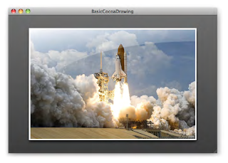
Curious as ever, I started to wonder how this same effect could be achieved as a custom control in LiveCode. What do we have conceptually?
- A background gradient behind the image
- An image with a 4px white border
- A drop shadow below the image
- A sheen over the image
The first three items are quite straightforward; but the sheen proved more difficult.
Let's get started. Note that I'm doing all my control creation and property settings via script. Just drop a button onto a new stack, set its script, and click on the button to get the custom control group. The first thing we want is the group itself and gradient background; easy enough:
on mouseUp
   local tGroup
   CreateCustomControlGroup "StyledImageView", tGroup
   CreateBackgroundGraphic tGroup
end mouseUp

private command CreateCustomControlGroup pGroupName, @rGroupId
   reset the templateGroup
   set the margins of the templateGroup to 0
   create group pGroupName
   put it into rGroupId
   reset the templateGroup
end CreateCustomControlGroup

private command CreateBackgroundGraphic pGroup
   reset the templateGraphic
   set the style of the templateGraphic to "Rectangle"
   set the rectangle of the templateGraphic to 0,0,400,300
   set the lineSize of the templateGraphic to 0
   set the opaque of the templateGraphic to true
   set the fillGradient["type"] of the templateGraphic to "linear"
   set the fillGradient["from"] of the templateGraphic to 0,300
   set the fillGradient["to"] of the templateGraphic to 0,0
   set the fillGradient["via"] of the templateGraphic to 400,300
   set the fillGradient["ramp"] of the templateGraphic to \
         "0.00000,45,45,45" & return & "1.00000,89,89,89"
   create graphic "BackgroundGraphic" in pGroup
   reset the templateGraphic
end CreateBackgroundGraphic
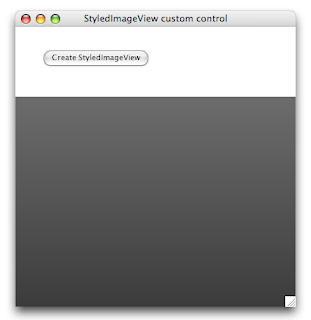
Here's the result of clicking on the button:
Now let's add in the image. Something that initially trips up a lot of new LiveCode developers is that an image will happily jump back to its original size if you don't set the 'lockLocation' of the image to "true". Another quirk is that you can't set the borderColor of an image control directly. However, it does 'inherit' the borderColor from the chain of owners (the containing group if applicable, the card or the stack) so to make sure we get a white border, we need to set the borderColor of our custom control group. So the following update to the button script will do nicely:
on mouseUp
   local tGroup
   CreateCustomControlGroup "StyledImageView", tGroup
   CreateBackgroundGraphic tGroup
   CreateViewImage tGroup
end mouseUp

private command CreateCustomControlGroup pGroupName, @rGroupId
   reset the templateGroup
   set the margins of the templateGroup to 0
   set the borderColor of the templateGroup to "white"
   create group pGroupName
   put it into rGroupId
   reset the templateGroup
end CreateCustomControlGroup

private command CreateBackgroundGraphic pGroup
   -- same as before, omitting for brevity
end CreateBackgroundGraphic

private command CreateViewImage pGroup
   reset the templateImage
   set the rectangle of the templateImage to 30,30,370,270
   set the borderWidth of the templateImage to 4
   set the threeD of the templateImage to false
   set the showBorder of the templateImage to true
   set the resizeQuality of the templateImage to "best"
   set the lockLocation of the templateImage to true
   create image "ViewImage" in pGroup
   reset the templateImage
end CreateViewImage
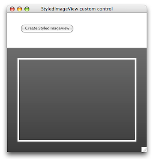
Delete the existing custom control group, and hit the button again. Here's what you should see:
Next up is the drop shadow for the image. While we could do this by setting the properties in the 'CreateViewImage' command above, I think it's better of we don't repeat code, and put that in the custom control group script - after all, we want to be able to toggle it via script. So let's drop another button on the stack, set its name to "StyledImageView Behavior" and start scripting that button. Later on, we'll set the 'behavior' property of the custom control group.
The most important item in the behavor script is handling resizing. We want to leave a margin of 10% around the image so that we can see the gradient background, and we want to scale the image proportionately rather than stretch it out. While we're add it, we'll add some custom property setters and getters for the drop shadow and the image file name. And we'll add a 'mouseDoubleUp' handler to allow the user to select an image. Here is the first version of the behavior script:
## engine message handlers

on mouseDoubleUp
   answer file "Select an image to view"
   if it is empty then exit mouseDoubleUp
   set the imageFileName of me to it
   pass mouseDoubleUp
end mouseDoubleUp

on resizeControl
   SIV_ReshapeControl
   pass resizeControl
end resizeControl

## property setters and getters

setProp showShadow pShowShadowBoolean
   if pShowShadowBoolean is "true" then
      local tDropShadow
      put 0,0,0 into tDropShadow["color"]
      put 8 into tDropShadow["size"]
      put 6 into tDropShadow["distance"]
      put 90 into tDropShadow["angle"]
      put 0 into tDropShadow["spread"]
      put 255 into tDropShadow["opacity"]
      put "normal" into tDropShadow["blendmode"]
      put "box3pass" into tDropShadow["filter"]
      put true into tDropShadow["knockout"]
      set the dropShadow of image "ViewImage" of me to tDropShadow
   else
      set the dropShadow of image "ViewImage" of me to empty
   end if
   pass showShadow
end showShadow

setProp imageFileName pFileName
   set the fileName of image "ViewImage" of me to pFileName
   SIV_ReshapeControl
end imageFileName

getProp imageFileName
   return the fileName of image "ViewImage" of me
end imageFileName

## private commands and functions

private command SIV_ReshapeControl
   local tImageRectangle
   SIV_DetermineImageRectangle tImageRectangle
   SIV_ReshapeBackground
   SIV_ReshapeImage tImageRectangle
end SIV_ReshapeControl

private command SIV_DetermineImageRectangle @rImageRectangle
   -- 10% margin around the image while preserving the aspect ratio
   local tSourceWidth, tSourceHeight, tTargetWidth, tTargetHeight
   put the formattedWidth of image "ViewImage" of me into tSourceWidth
   put the formattedHeight of image "ViewImage" of me into tSourceHeight
   put (the width of me) * 0.8 into tTargetWidth
   put (the height of me) * 0.8 into tTargetHeight
   -- make sure we don't get divide by zero errors
   if tSourceWidth = 0
   then put 1 into tSourceWidth
   if tSourceHeight = 0
   then put 1 into tSourceHeight
   local tScaleFactor, tImageWidth, tImageHeight
   put min(tTargetWidth / tSourceWidth, tTargetHeight / tSourceHeight) into tScaleFactor
   put trunc(tSourceWidth * tScaleFactor) into tImageWidth
   put trunc(tSourceHeight * tScaleFactor) into tImageHeight
   local tLeft, tTop
   put (the left of me) + (((the width of me) - tImageWidth) div 2) into tLeft
   put (the top of me) + (((the height of me) - tImageHeight) div 2) into tTop
   put tLeft,tTop,(tLeft + tImageWidth),(tTop + tImageHeight) into rImageRectangle
end SIV_DetermineImageRectangle

private command SIV_ReshapeBackground
   set the rectangle of graphic "BackgroundGraphic" of me to the rectangle of me
end SIV_ReshapeImage

private command SIV_ReshapeImage pImageRectangle
   set the rectangle of image "ViewImage" of me to pImageRectangle
end SIV_ReshapeImage
So just a little tweak to our 'Create' button script is required to set the behavior and activate the drop shadow:
on mouseUp
   local tGroup
   CreateCustomControlGroup "StyledImageView", tGroup
   CreateBackgroundGraphic tGroup
   CreateViewImage tGroup
   set the behavior of tGroup to the long id of button "StyledImageView Behavior"
   set the showShadow of tGroup to true
end mouseUp

private command CreateCustomControlGroup pGroupName, @rGroupId
   -- same as before, omitting for brevity
end CreateCustomControlGroup

private command CreateBackgroundGraphic pGroup
   -- same as before, omitting for brevity
end CreateBackgroundGraphic

private command CreateViewImage pGroup
   -- same as before, omitting for brevity
end CreateViewImage
One more thing to do before we call it a day: handle the 'resizeStack' message in the card script, so that we automatically resize the custom control group as the user changes the stack size. Just plop the following into the card script:
on resizeStack pNewWidth, pNewHeight
   if there is a group "StyledImageView" then
      local tRectangle
      put the rectangle of group "StyledImageView" into tRectangle
      put pNewWidth into item 3 of tRectangle
      put pNewHeight into item 4 of tRectangle
      set the rectangle of group "StyledImageView" to tRectangle
   end if
   pass resizeStack
end resizeStack
Delete the existing custom control group and hit the button again. The embedded image control now has a nice drop shadow, which we can turn off and on using the message box or by scripting a simple checkbox button.
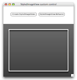
And when you double-click on the custom control, you can select an image file and the embedded image control automagically reshapes in order to display the chosen image file proportionately.
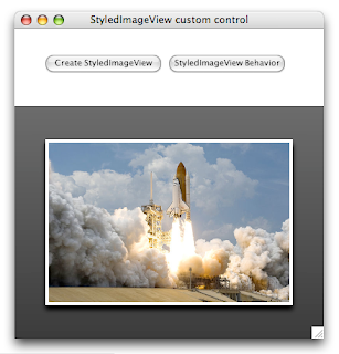
Looks good doesn't it? Next time, we'll tackle the sheen. It's tricky, but it can be done!
2 comments:
I actually enjoyed reading through this posting.Many thanks.
Custom Software Development
just linked this article on my facebook account. it’s a very interesting article for all.
Custom Software Development
Post a Comment